Project Concept
How do you design a logo for someone you've never spoken to, without a creative brief, in a weekend? In early July of 2020, eaJ (a not-for-profit music project) made a call for logo and banner work, with particular respect to YouTube.
Although my bid was ultimately unsuccessful (check out the official branding here!) participating was a great, albeit impromptu, experience that resulted in some neat work. Enjoy!
Research
The eaJ platform is the brainchild of Jae Park (widely known as Jae of Day6).
However, the eaJ project is his exploration of independent music projects, and as such, is deeply linked to Jae as an individual. Thus, the concepts for the logos are centred on key components of Jae’s life, interests, and musical works under eaJ.
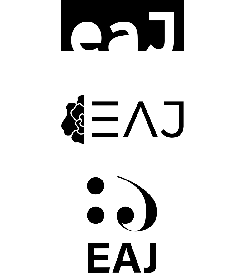
An icon and word mark combination logo provided the most visual flexibility, and became the foundation for many of the concepts that were delivered.
The target demographic for this project was identified as primarily English-speaking. Therefore, these concepts continue to employ an English word mark (Jae, backwards), to better facilitate brand continuity.
Ideate
Inspiration for the eaJ rebrand narrowed to three, focussed themes:
Places: pairing the introspective nature of eaJ’s music with his ability to capture the essence of places in his videography work. As eaJ writes, “what you see depends from where.”
Lyricism: focussing on Rose, one of eaJ’s most well-loved works, which reflects his keen insight into his fans’ pathos, to create floral imagery.
Rebirth: blending new beginnings with imagery fans associate with Jae. This includes details like his favourite colour (yellow), and references to the character Chicken Little, that have endeared Jae to his audience.
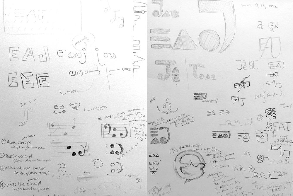
Create
Ultimately, three different logo concepts were submitted for consideration:
Final Product
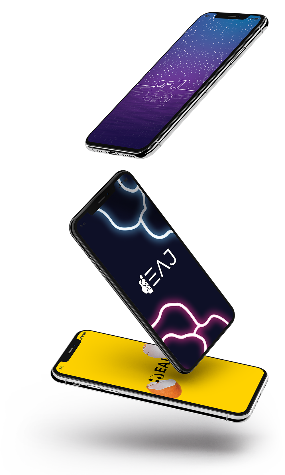
The first concept features a single line construction of the letterforms, allowing them to be used easily in both shape and linework contexts. The banners also include minimalist skylines of both LA and Seoul, representing the two countries and cultures that have largely been responsible for shaping his experiences.
Can you spot the rainstorm icon in the second logo? (You might need to tilt your head!) It alludes to the pensive qualities of eaJ's sound, which are perfect for nighttime and rainy day listenings. The floral letterform also directly references his musical work, Rose, which is amongst his most well-known.
The third logo concept is also deeply intertwined with music. The J is built from a modified base clef, and the two circles beside it can be constructed from the musical representations of the letters A and E on a musical staff.